Koali is an early-stage startup focused on creating an IT automation platform to help organizations seamlessly manage their software, devices, and tasks. As the sole designer, I was responsible for designing the entire platform. In this project, I’m specifically highlighting the design and development of the dashboard.
My Role
UX Designer
Timeline
3 month
Collaboration
1 Engineers, 1 PM
Status
Added to product roadmap
Context
What is IT automation?
Using software to handle tasks automatically to reduce manual effort
IT automation is the process of using software tools and technology to perform routine and repetitive tasks, such as system updates, backups, monitoring, and software deployments, without the need for manual intervention. By automating these tasks, organizations can reduce errors, save time, and improve efficiency, allowing IT teams to focus on more strategic and high-value activities. IT automation not only streamlines operations but also enhances system reliability and scalability by ensuring that tasks are performed consistently and on schedule.
Problem
A IT team manages ~300-400 devices, tasks, and software on a daily basis.
For Koali, we want to create an intuitive dashboard to:
As an early-stage startup, Koali needs an intuitive dashboard to quickly deliver value to users, helping them manage IT tasks efficiently without a steep learning curve. A well-designed dashboard sets Koali apart in a competitive market by offering a seamless experience, building user trust, and driving adoption from the start.
Establish value proposition
Enhance user’s workflow
Drive user adoption & customer satisfaction
Research Summary
Interviewing a wide range of user & roles
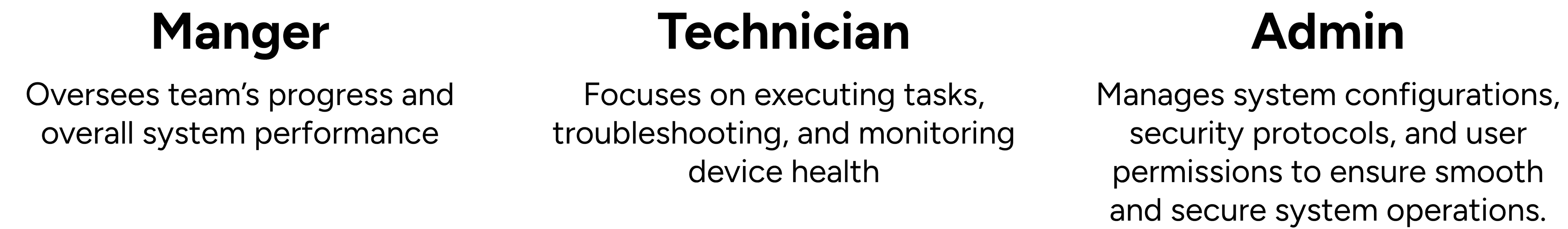
Insight from users
Critical alerts go unnoticed, causing delays in fixing issues.
Data is scattered and complex, making it hard to quickly interpret and act on key information.
Irrelevant data makes it hard to focus on priorities.
How might we create a dashboard that provides focused and prioritized information, allowing users to track tasks, respond to critical alerts, and quickly act on key data?
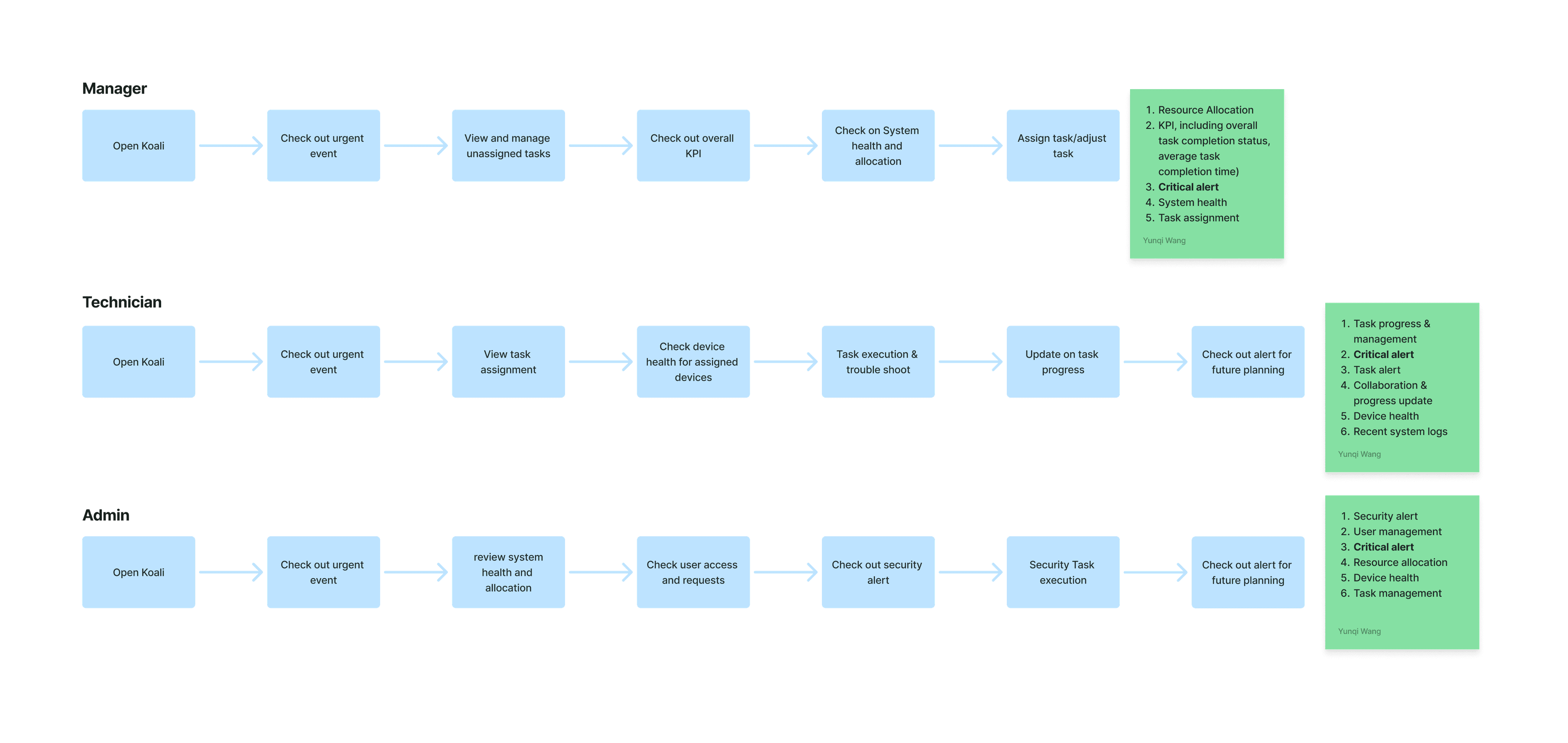
Emphasizing on users
Mapping out users' workflow
Identify key information needed by different user groups
To effectively understand what are the key information needed for different user groups, I mapped out their regular workflow to ensure the dashboard is focused and can help user effectively find information they need without being overwhelmed.
Exploring layout
Laying out feature priorities
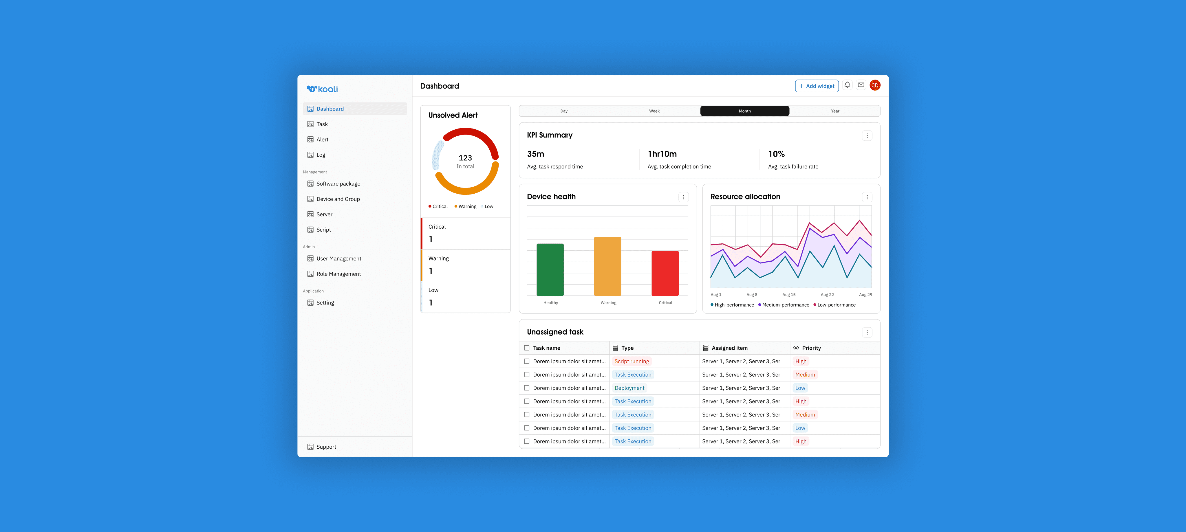
Static + Non-static sections
To ensure users will not miss critical alerts while providing a focused experience. I decide to provide a dashboard containing static critical alert section, with non-static section that allows users to customize based on their need.
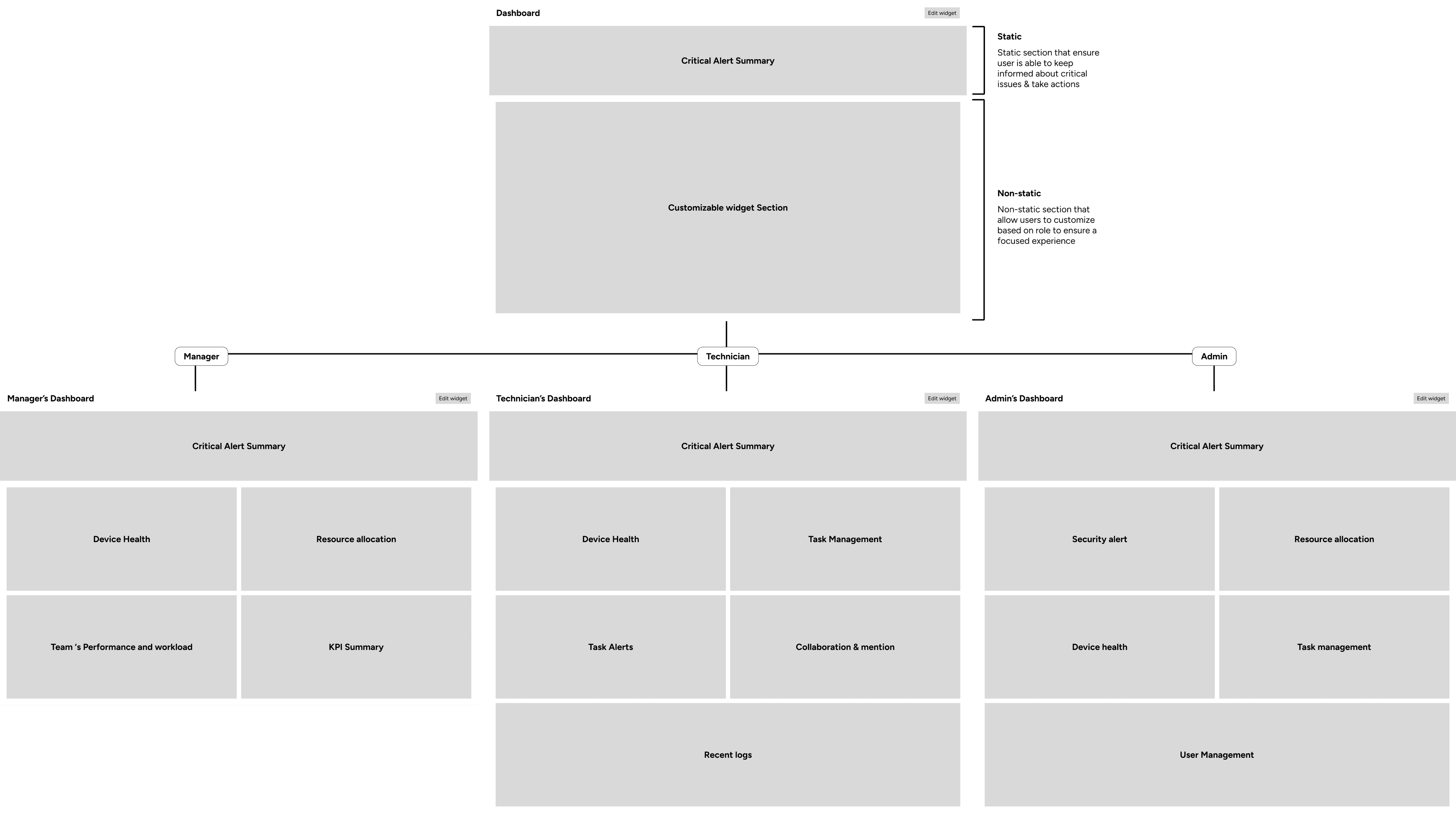
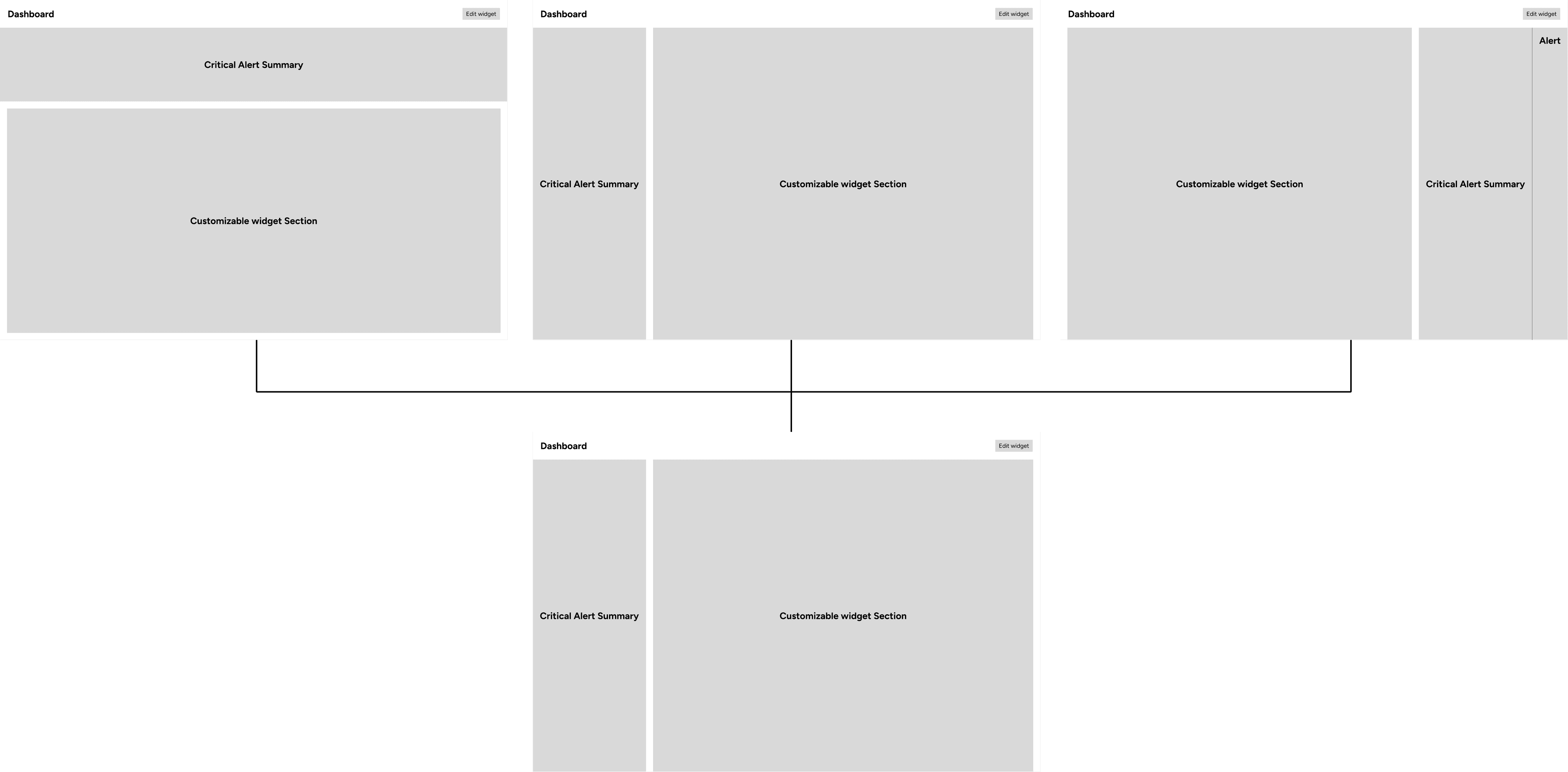
More detailed exploration for critical alert position
To ensure users will not miss critical alerts while providing a focused experience. I decide to provide a dashboard containing static critical alert section, with non-static section that allows users to customize based on their need.
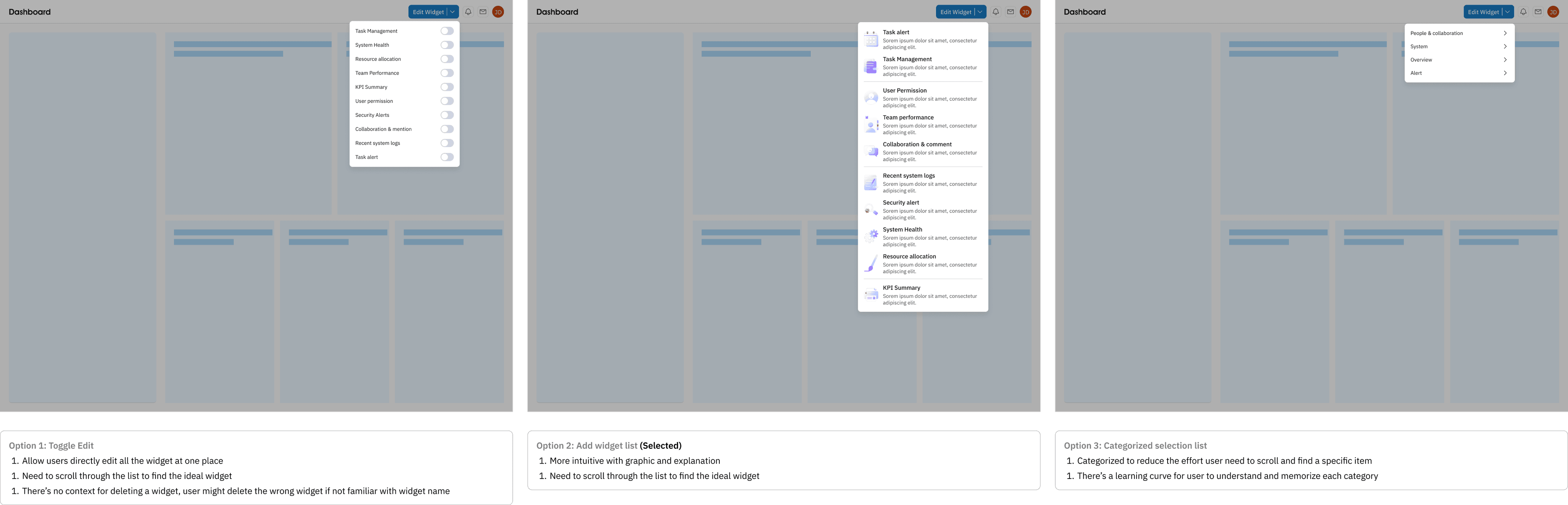
Weighing between adding widget options
To help user effectively set up dashboard that contains key information that's relevant to them, I explored 3 different options for users to edit and add widget. At the end, I decided to select 2nd option to provide a more intuitive and informed experience for users.
Data Visualization
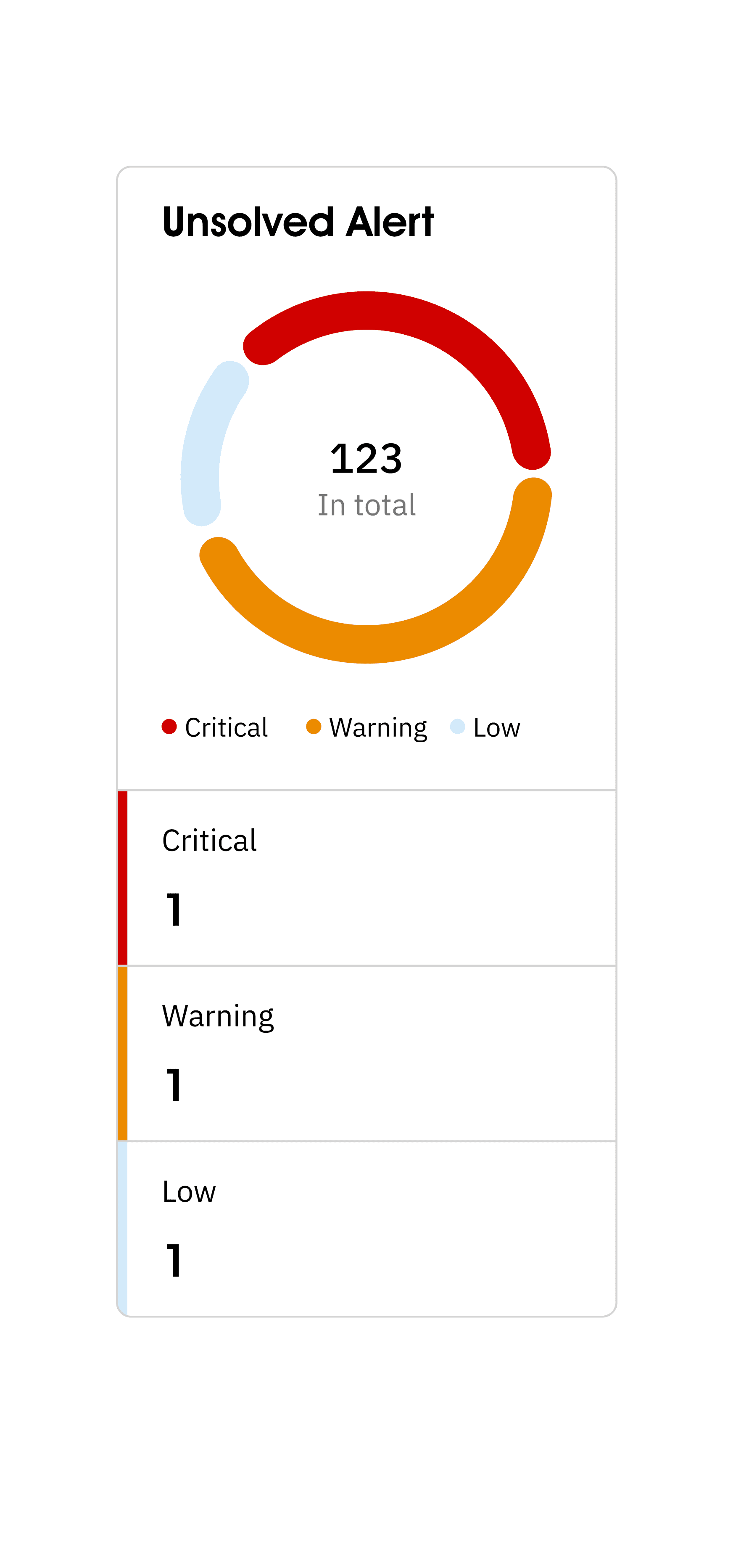
Visualizing critical alert.
Initial exploration
Considering users sometimes miss critical alert, in order to ensure users are informed about alerts and be able to effectively take action, I decide to explore ways that can make the critical alert overview more intuitive and decrease the possibility user will miss them.
Validating with users
With the different options, I then seek for feedback from users to understand their preference.
Donut chart is the most intuitive and straightforward one
Instead of all alert, user would want to see unsolved alert
There should be a more intuitive way to show the numbers
Wireframing
A semi-customizable dashboard that ensure simplicity & focused experience.
Providing a straightforward and simple dashboard experience.
With the design decision made, I start to create different widget for dashboard. In this process, I collaborated with subject matter experts and made 3 key design decisions.
Improvement
Incorporating user feedback
Change tag color & layout
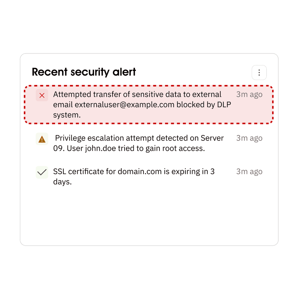
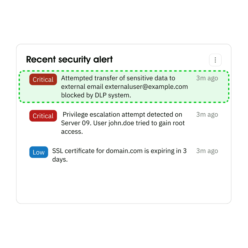
To provide a more intuitive and distinct experience to help user identify alert level, I decide to change icons to text and reduce tint to enhance its visibility.
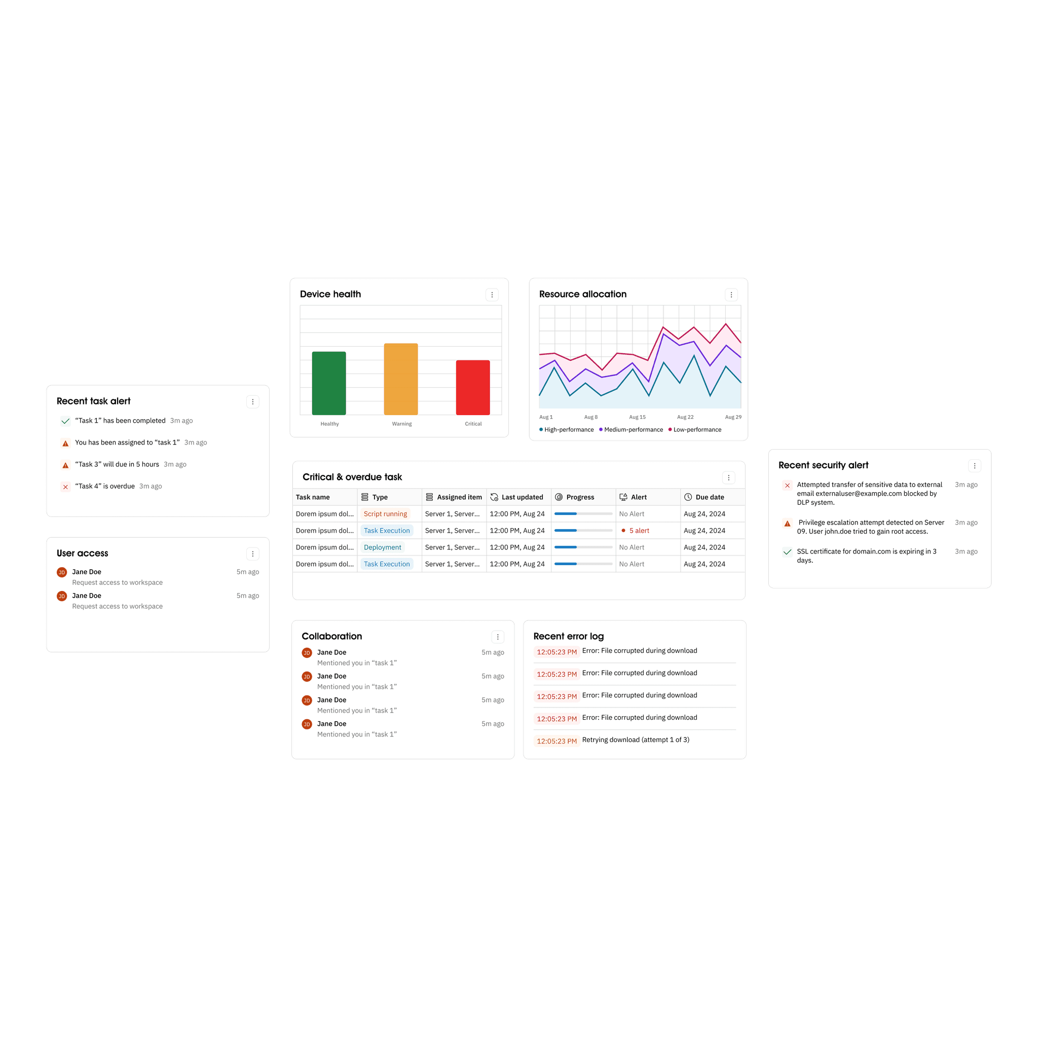
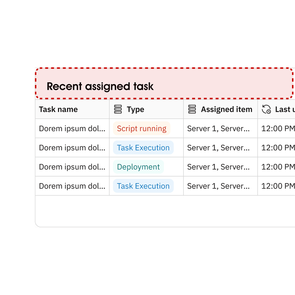
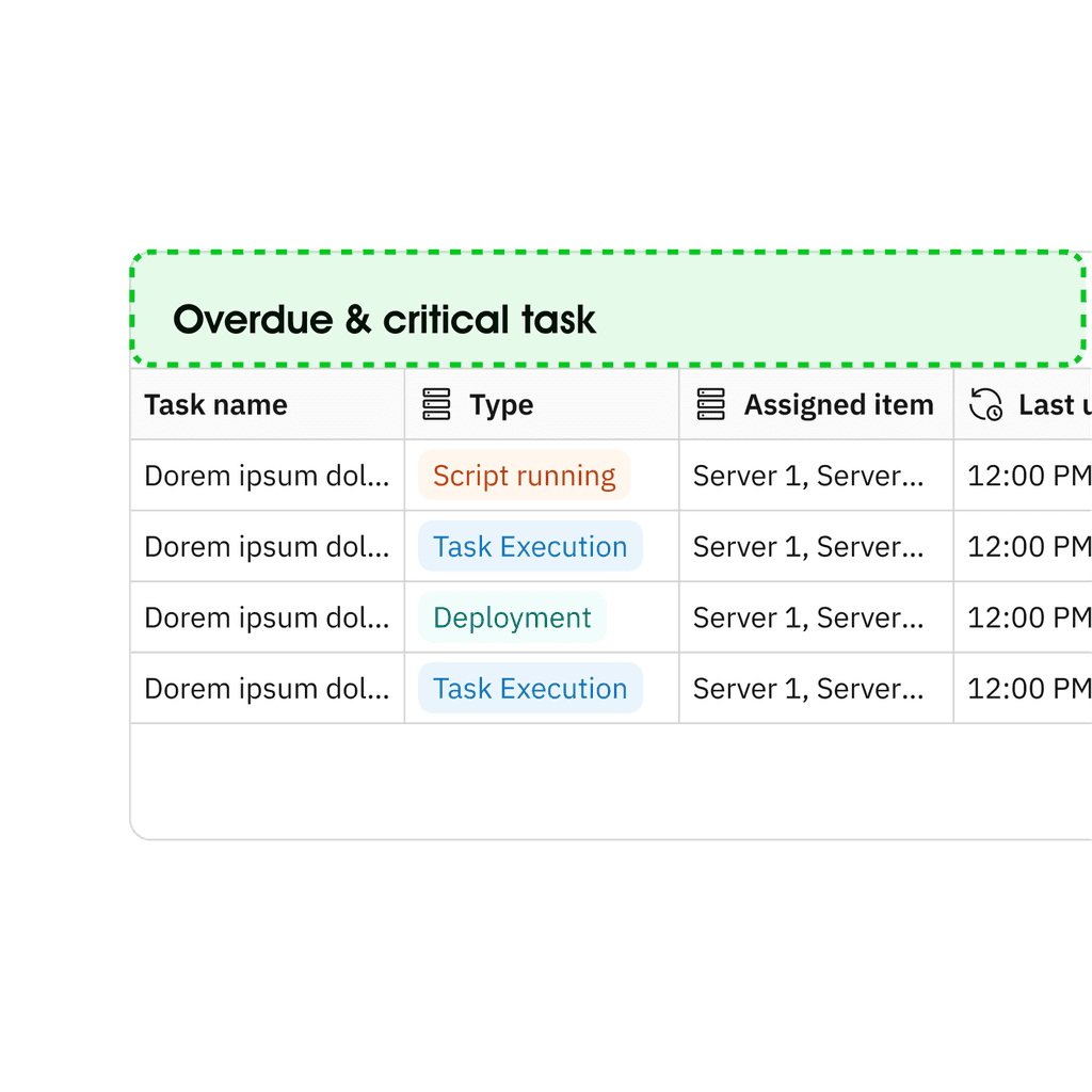
Adjust task content
Instead of showing recent assigned tasks, I decide to change to overdue and critical task to ensure user is able take action on most urgent things first.
Impact
80%
Decrease in incidence of missed critical alerts
40%
Decreased in task completion time
Impact
A dashboard that provides focused a straightforward information
Helping users to effectively understand and act on key data and critical alerts.

Takeaways
Balancing Complexity and Clarity
I found that my background in engineering and data science was very helpful in understanding the technical context. However, when initially designing the data visualizations, I tended to overcomplicate things, often creating detailed and complex graphs that weren’t always easy for users to interpret. Through discussions with users and subject matter experts, I learned the importance of simplifying the visuals to focus on the most critical information. These conversations helped me create a more user-friendly and actionable dashboard, balancing technical depth with clarity.
